Tuesday, December 13, 2011

NMA object browser

Success! Everything came together at the end of semester.

I got on the web, got all the data hooked up and and built a simple browser interface that worked.

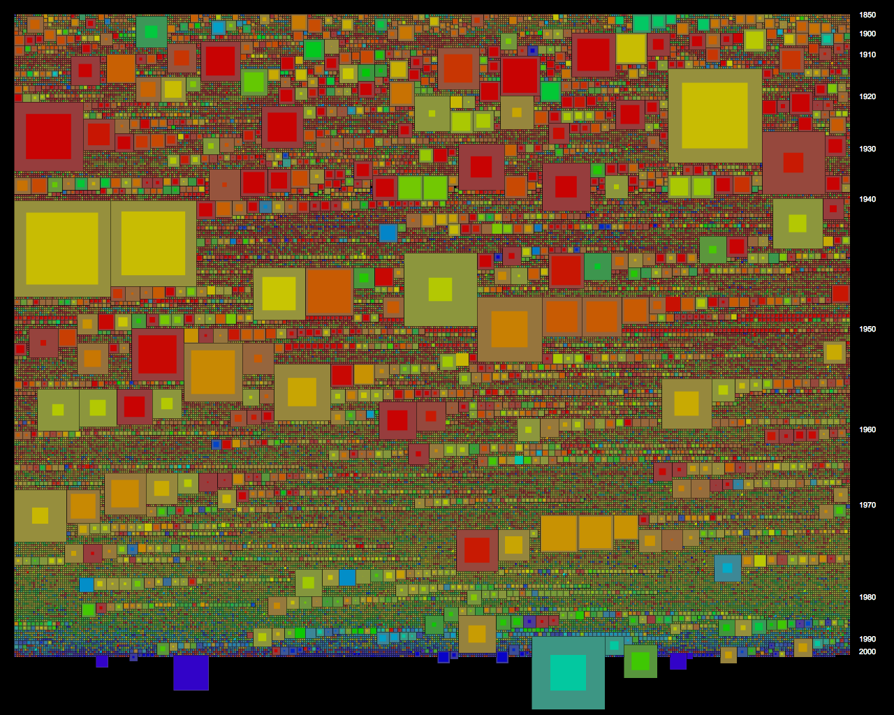
NMA object browser - displaying drawing (right) in context of all drawings the NMA holds (centre) and all object types (left) 
The idea was to show as much context as possible on the screen at the same time to aid greater understanding of objects in the NMA's varied collections, which is particularly useful where individual item records are sparsely populated, and to encourage browsing to other like or different objects.

On the left is a list of all object types, with counts, ordered by count. Clicking on an object type brings up all of the items of that type in the centre window. These are displayed as a thumbnail grid of images, or where images are not available as catalogue reference numbers (IRN) with truncated titles. Of course the preference would have been to have all images, but I felt it was important to include all items, and the truncated titles are still often informative and visually look ok.

Mousing over an item brings up the title in a popup box in the right corner. This is simply a div with a z-index to ensure it is on top of everything else. Upon mouse out, the popup div is removed using JQuery $.remove(). Easy. This was one issue to note - having to remember to do a mouse out as well as a mouse over function was a little tedious, although I can see it could be useful. It would have been nice if there was similar to in CSS, an additional mouse hover event - which I used to make links underlined when moused over. Using the CSS cursor propoerty, I was also able to make spans and divs look like <links> with the hand pointer.

The objects are sorted chronologically, using provenance date over associated date if both are available. Items without dates are retained, and placed at the end of the list. The year is displayed under the item image/title. Displaying as an inline histogram of sorts adds a rich contextual dimension - otherwise to find out dates one would have to zoom into an individual item record, and even then there would be no way of knowing how many other items were from the same year and what was the spread of years for items of that type. Thankfully the source data was in a consistent format with year first, and then day and month after if available, as a single string, which allowed for sorting a simple extracting of the first four characters using the JavaScript substr() method.

On the right a summary of an individual item record is displayed. The first item in the sorted list of object types is automatically loaded. Other items can be loaded by clicking on them in the display grid, or by clicking next/previous to cycle through the list. Mousing over the next/previous links also brings up the popup with title, as a preview. It was a critical design intention to keep the zoomed in display on the same screen as the full collection context, rather than in a pop up or new tab. The full record on the NMA catalogue is still linked to, for further information.

NMA object browser - mousing over a collection title highlights the objects within that collection
Like the sorting chronologically, an important intention of the browser was to hook up other ways of sorting and sub-sorting the NMA collections. I attempted and adequately demonstrated the potential of this, by hooking up collections data to the list of items of object type. I was able to build a list of the collections that these items were part of and at the top of the centre window list the 5 collections that contained the most items of object type with counts. Mousing over a collection title highlights the collection by fading all the items not in the collection. This is achieved by changing the opacity accessed neatly with getElementById(#id).style. The mouse over worked very nicely, except there were two interface issues: for long lists you couldn't scroll to the bottom of the list without mousing out; and I didn't have room at the top of the window to list more than 5 collections.

There would be some easy extensions to this browser, which I would pursue if it was to be hosted on the NMA labs website - that is basically more links, more context. Clicking on a collection would bring up that entire collection in the browser centre window, and browse mode could be flipped to browse by collection, with all collections listed on the left. With the same architecture it would be easy to add other browse modes, such as material type, date or associated people.

So although I didnt get time to add all of this extra context, or refine further the browser interface, or draw some graph/visualisations, I am very glad that I challenged myself and built it to be native to the web. Once set up with data, the linking and mouse events work seamlessly. I feel like I could have fun linking up more and more and more, and am now ready to tackle some more websites!

I do think I could tidy up the code and data work a little. For example I forgot about global variables for much of the project and found myself getting convoluted in passing information to functions. I also could have prebuilt more of the lists, and done all the sorting, in Processing - to speed things up at the browser/client end.

That said, the next step really would have been to develop the NMA API to handle all the data calls, and this would allow the data to always be up to date. I wouldn't want to prebuild lists every month, when the NMA catalogue is added to.

Even if in a rudimentary form, I have established my confidence in showing everything in a big data set in a meaningful way. A great project to finish the Masters of Digital Design. Big thanks to Mitchell, and also to the National Museum for the privilege of working with this special data (which now must be wiped from our systems).

Sunday, December 4, 2011

NMA project update - debugging

All my focus seems to be on the technical side of things - getting it to work in the web world has been overwhelming to say the list.

The last couple of weeks I have been doing some series debugging. There are so many seemingly simple things that catch you! Here are some updates.

First to report. I prebuilt a list with each object type and a count in Processing. It made loading super fast! Great news. I am now able to handle easily the whole collection - at least at this zoomed out level and as a simple text list.

I still am sorting the list in the browser with JavaScript, although there is no need to do this dynamically so I could be saving more resources by presorting too.

A prebuilt list of object types

I also prebuilt lists of all the items of each object type, but I got totally stuck linking it up to the super list. I tried to embed the object type as a key in a mouseclick function so that the list of items would be loaded when the object type was clicked on. I realised, as before, that as the mouseclick event would not happen at the time of drawing, I would have to hardwire the key. This time however I couldn't get it to pass in the key as a string. Previously I was able to escape by using single and double quotation marks, but not this time. After much consternation it was an easy fix - visiting Mitchell. I needed to use backslash ' \' to denote that the character immediately after is real.

So great, now I was able to load a list of lists, and navigate to each... well almost..

Lists of item titles displayed for object types that have been clicked on

... not all the object types worked! It appeared to be those with spaces between multiple words.

Mitchell also showed me Firebug and how to write to the console - console.log(), which is neater than using JavaScript popup alerts to debug as I was earlier. The great thing about Firebug is that it is able to follow all the script, css etc from linked files and to show how it modifies the html.

So my initial though was that it couldn't load the json files that had spaces in the file names. This would make sense as I had previously learned that the web doesn't like spaces and often replaces that with % signs and other characters.

However  I was able to prove that I was loading the data by writing to the console the list length and each item's title. This was puzzling indeed.

Firebug console showing item titles for 'record covers' object type which dont display  on screen
So further investigations led me finally to discover that the id attribute can't contain spaces. This was my problem - I was using the object type to name the header div, so that I could call it later to append the list of items of that type.

The solution: I needed to find a way to parse the object type name and replace the space with a dash or underscore, which the id attribute would accept. (The id attribute is fussy - it wont allow the name to start with a number either).

Luckily I found a string.replace() function native to JavaScript. It took a bit of figuring out however. I couldnt get a standard regular expression like /s, which removes all whitespace, to work. I could however get my custom specified regex pattern enclosed by forward slashes to work,  ie literaly slash space slash, '/ /'. I then had to follow it with a 'g' to indicate global, which removes all the spaces not just the first as is the default otherwise.

So now I have to keep track of key and key2, because I still need the original with the space for display and to locate the file names. Anyway it works!

'head ornaments' and 'performance costumes' lists of item titles of that object type
However there were still a couple of object types that had parentheses in their name and so had the same problem with the id attribute. Writing a regex for parentheses was hard! Again I had to escape using the backslash, but I couldn't get it to work all in the one replace() function listing all characters in my regex pattern to replace at once as tutorials seemed to indicate was possible. I eventually through trial got it to work one character at a time with three subsequent replace() functions - one for the space, and one each for the opening and closing parentheses.

Once this was all working, I was also able to implement a few tidy ups.

I am now using the <span> tag rather than the <a> anchor tag, so that it doesn't refresh and lost my place on the page. With CSS cursor and hover properties I am still able to get the <span> to appear as a link.

I was also able to use the JQuery $.empty() to empty my container div that holds the list of items. This, coupled with a custom data-display = "on/off" attribute to act as a switch, means that clicking on an object type a second time hides the list of items rather drawing them twice. Neat.

Finally I plugged back in the images, put the item titles (truncated) in my place markers where there are no images, and linked them back to the NMA online catalogue. It is starting to come together, and look neat. Hooray!

'paintings' and 'bowls', items displayed with images if available else titles

Tuesday, November 15, 2011

NMA project update - drawing with images

I have been experimenting with how to draw and layout content - the image grid particularly. Here are a few of my iterations.

I was excited to try some html 5, so I dove right in and played with <canvas>. After figuring out how to get the canvas and make a context in it to draw to, I was able to layout the grid much as I would in Processing. As I ran through my loop of items I kept track of their x and y positions, and I could easily draw rectangles for items without images - canvas was intended for drawing.

Having smaller squares as place holders for items without images works pretty well to make the visualisation more compact and get more images (= interesting) on screen at once.

Object type sets drawn with an absolute position in a <canvas>

Working with canvas I even was able to make it scalable - by calling the draw function with both window.onload and window.onresize events, and then setting the canvas size to window.innerWidth and window.innerHeight.

However the problem with this approach is that everything that is drawn is not an html object, and therefore is static / can't be interacted with. In fact to have mouseclick or mouseover events would require separately keeping track off the mouse position, as you would in Processing. This is madness when html objects already have mouse interaction natively built in.

So next I went back to appending html using the JQuery $.append(string).  Here I threw back all the images with absolute position, set again by keeping track of x and y positions as I looped through the items. The images had a straight html link also.

Object type sets (items with images only) drawn with absolute position as html <img>

This was ok, but clearing the old images, running through all the date and recalculating x and y positions each time the window was resized made it slow and clunky (and only working with 800 of the 48,000 items). Also I was appending html after collecting it for an entire object type set - it would be nice (and easy) to append after looping past each item so that on a slow load you would be able to see the visualisation being populated.

A better way I quickly discovered was to use the document flow. The trick that had alluded me was an object display property 'inline-block', which allowed me to create objects (I started using the generic <div>) that had fixed dimensions and that followed one after another inline - ie all my earlier attempts with the document flow had resulted in each list item having a new line. One note - it appears, like canvas, to not be supported everywhere. To get this to work I had to upgrade to the lasted versions of Internet Explorer and Mozilla Firefox.

Object types sets drawn in the document flow as fixed dimension divs, inline-block

Looks good. The fixed dimension divs without images simply have a background colour. This actually is a very straight forward way to draw rectangles.

I still however had one small hiccup. The mouse interaction obviously doesn't happen at the same time that the html is being written in loop. I had to find a way to get the object to remember it's reference irn so that it could link to other stuff. I did this by writing at the time of the initial append, onclick to call a clickFunction with the particular irn already hardwired to pass in - ie onclick='clickFunction(" + item.irn + ")'.

An alert demonstrating that an item's reference irn can be recalled and that therefore interaction  is possible

I also made the object id be the irn so that it can be called from anywhere - this should allow me to highlight objects in the future! Apparently there is a convention for data attributes, ie storing data as a property rather than content - this seems counter intuitive, but perhaps it is a useful way to attach data but keep it hidden.

That's all for now.

Sunday, October 23, 2011

NMA project update - getting data organised, again

Ok so now that I am on the web, I have to get data organised (again). Here are the results of some of my playing.

This first sketch here I have ran through a for loop of the collection to build an associative array where the key is the object type and the value is a count of how many items there are of that type. I don't think I fully understand JavaScript associative arrays yet - I have been thinking of them like hash maps in Processing, but I think that really they are just a normal object (and that even a singular object is the first item in an array), and that keys are not keys but actually object properties. When testing if my associative array already contains a particular object type I use objectTypeList.hasOwnProperty(object_type). When getting items I can call them either with objectTypeList[object_type] or objectTypeList.object_type, but they dont have an index and it appears I cant get their length - to run through a for loop I can use for(key in objectTypeList).

To display, I am adding each item to an unordered html list with $.append, which I am also using to format the object type as bold. It would be better to put the object type and the count in different html tags with unique classes so that the formatting can be done separately with CSS.  The yellow background is however thanks to CSS.

A list of object types and count of items of that type

If I wanted to get all the keys out as an array I could do so with .keys however this appears to only have support in the very newest browsers. For now I will run through a for loop and get each individually. This leaves me wondering if I am missing a better approach to organising my data?

A list of object types and titles of each item of that type
Breakthrough! Yay! This second sketch here is organised. I have built lists of each object type, adding the items of that type - no need for custom classes, the items appear good to go straight from the JSON as JavaScript objects. Displaying all the titles is proof that I can access the individual items. I am in control! Now the count is the length of the lists.

Problem - handling undefined keys. Don't know how to skip. It appears all items have a title and object type recorded, but there is variable use of most other parameters. Something to come back to..

Next step in getting organised. Sorting. JavaScript .sort() worked nicely on this list of keys, which I extracted as described above. The sort function defaults to sorting alphabetically for a list of strings, to sort numerically I had to write a simple comparator function that compared the item list lengths. Once I have a sorted list of keys I can loop through it and using the key still access the individual items.

A list of object types sorted alphabetically
A list of object types sorted by count descending of items of that type
And finally I was able to load images in, simply using the <img> html tag and the $.append. What a relief! Now I have all the basic ingredients to make some of browser for the NMA collection.

A list of object types and images of each item of that type if available
Actually it turns out the problem above about identifying undefined properties/keys was very simple to resolve with an if(key == undefined).

A list of object types and images of each item of that type if available with a count of available images
And just to tidy up my weekend of getting data organised, I was able to make each image a link to the corresponding item record in the NMA online catalogue. Quite satisfying!

Item record in the NMA online catalogue linked from my list of object types
A big thanks to Mitchell for getting me started with some of his sketches.

My next steps will be to try working with the full dataset (I have only been using the first 800 item here), and to draw only what is on screen so there are not huge numbers of images flying around (see if I can get ajax to work now?). Then I will need to learn to draw so that I can get more sophisticated formatting and so that I can design some analytical visualisations (charts, graphs etc). For these I could try Processing.js or Raphael or D3.js which supercedes Protovis.

Thursday, October 20, 2011

NMA project update - how do I get on the web?

Big scary hurdle. Don't know where to get started. Moving out of my comfortable Processing world. Have to learn many new things at once...

First step I thought would be to get my data into the browser. I thought I would need to make a database and then an API to call to it. My website back of house allowed MySQL databases and had phpMyAdmin installed to manage. Ok so I know it isn't standard  to develop and test online, but I didn't/don't want to learn how to set up a local server, at least just yet, on top of everything else that is new. So I looked at phpMyAdmin - I can upload XML, but not JSON, and only files less than 100mb. So the very first thing to do is export a clean small XML version of the data. Stuck already. Stayed stuck for days.

I tried to write XML with proXML, a library for Processing. But I couldn't figure out how to actually put any data content in the XML elements. I could make elements. I could give them attributes and add children. I could check if elements had data content (text) and get that text. Seems such a basic thing. And the documentation for the library was otherwise good. I tried lots of ways that I made up myself to add data, but could only write elements that were not correctly formed. I couldn't find any help on forums either.

Then I tried to write XML using Java StAX. This library required you to explicitly code opening and closing tags and start document etc. Writing to a stream and remembering to flush was ok. My output used Java  FileWriter, which I thought should work. But it didn't! I kept getting error: access denied. Why? I couldn't figure it out - for ages. Turns out, after investigation prompted by Mitchell, that the Java file path name wasn't relative and so it was trying  to write at my top level C: drive! Problem fixed. Exported clean XML.

However at Mitchell's suggestion I decided to instead change approach and, at least initially, try to directly load JSON into the browser and work with it. Hopefully the files wont be too big - usually in web you would would (with an API calling to a database) only load the bits you actually needed at any particular time. Mitchell kindly gave me some sketches to hack to get started.

So working with JQUERY I made my first JavaScript sketches, which selected html elements and changed their formatting or added content. Yay, achieved something! Next I tried to load some data - but was badly stuck again. I couldn't get $.ajax({ url: ''dataURL" }).responseText; to work, nor $.getJSON. I eventually was able to write some JSON elements in html file and work with these, but I still couldn't get JSON to work. In fact I was just about to give up after most of a day of trying different combinations of $.ajax, $.getJSON, JSON.parse(data) and even eval() which I understood  to be a big no no because it didn't parse to check for valid JSON and so was a security threat. I had tested online and locally, neither worked.

I searched help forums to find why the functions were hanging or resulting in variables that were undefined. Then I realised that there were some syntax errors in the JSON data - they were just a bunch of objects floating, not separated by commas in an array. I fixed this, but is still wouldn't work! Searched some more but still couldn't find a solution.

Finally - brainwave - try a different browser. Works!!!
Don't know why I didn't think to try this earlier. Browsers are notoriously fussy.

So nothing would work for me in Chrome. Don't know why. In Internet Explorer $.getJSON works, but I still couldn't get $.ajax to work. Don't know why!

Anyway here is my very very sweet hello world.

A list of item titles with their object type in brackets

Next, now that the data is in the browser, I will begin to play with it...

End frustration.

Wednesday, October 5, 2011

Getting data organised

My first task with the NMA project was to get started working with the data. Mitchell Whitelaw helpfully set us up with some example code.

Our data came in a verbose xml that was too big to keep in memory in  Processing, so Mitchell showed us how to in Processing split the data and parse it into JSON format one line at a time, extracting only the data we needed. JSON is a lightweight format based on JavaScript that works well with Java (Processing).

Mitchell also demonstrated loading images from the collection (you can't load all at once - there are 20,000 in 3 different sizes!) and picking random objects to show, using a class for items. He also showed us hashmaps, which I first used with myTram - calling a key is much easier to work with than trying to remember an index position. The hashmap here contains arraylists of items organised by object type.

I used the hashmap to select a random object type to show all of the objects of that type in the collection. Clicking through random object types is not a bad way to start browsing. The data was indeed organised!

Showing an object type - motor cars, there are 11 in the NMA collection
Next I wanted to be able to sort the data, so that I could view it other than randomly. It was easy to sort an array alphabetically or numerically using the Processing sort array function, so I converted my arraylist of object types to an array, and hey presto I had a Ben Ennis Butler inspired histogram! It was indeed easy to scroll though object types and see how many of each there were.

Object type histogram, alphabetically sorted - advertising cards
Due to memory I only visualised the first 20 object types, but in the future I could have a more sophisticated way of not bothering with what was not on screen.

After this, however I was stuck. I wanted to sort numerically by the number each object type. I couldn't do this with arrays, because even if I extracted an array of all the counts and sorted this, there would be no way to syncronise it with any other lists.

The answer - to make another class for objtypes, and then to use comparators which instruct how to compare objects. In this case the comparator says when sorting an arraylist of object types to compare them based on the size of their corresponding arraylist of items.

I visualised this simply as a list for now. I would have to think about what to do visually with the scale difference between the most numerous couple of object types (6000, 3000, 2000) and the quick drop off (to a few hundred) and then a long tail (2, 1). Mitchell suggested something like a treemap that was compact.

List of most numerous object types - there are 6,000 mineral samples in the collection

List of some of the object types for which there are only 1 in the collection

I think that now I have the organisation to get started in making mockup visualisations in Processing - I still have to figure out how to translate to an online world. Hopefully I can experiment with the NMA API before building my own MySQL database.

Tuesday, October 4, 2011

Interactive word frequency cloud

Following the data visualisation unit, I was lucky enough to have the opportunity to work over summer as a research assistant for Andrew MacKenzie to develop a tool to explore survey responses from residents, architects and builders who had rebuilt in Duffy after the 2003 Canberra bushfires. The word cloud was built with supervision from Mitchell Whitelaw and is based on code he developed for the A1 Explorer.

Word frequency cloud (architects only, responses to all questions)  with substantial control panel  for filtering at right
Word frequency cloud with correlations to 'wanted' highlighted and all occurrences of 'wanted'  listed on right
The data can be filtered by response to particular questions, the category of respondent (resident who rebuilt, new resident, architect, builder etc) and individual respondent - so it is possible to see a cloud of everything or  any subgroup of responses or an individual response. A list of standard 'stop' words  and any words with less than 3 characters have been removed. Further words can be added to an exclusion list, by clicking, which is helpful to look beyond boring words or extremely frequent words that can obscure differentiation between less frequent words.

All of these filtering options end up in a large control panel, which took a bit of juggling to fit on screen. It may have been neater to hide it in drop down  or pop up menus. However I think it was important to highlight the current view position within in the entire data set.

Mousing over a word highlights corresponding words that occur in proximity and brings up a scrollable list of all occurrences of the highlighted word in fragmentary context of the five words pre and post it.

An appropriate way to understand and navigate data?

So this is another example of a show everything and zoom in visualisation. However the reason I posted it is primarily to make a brief observation about the appropriateness of visualisation techniques to understand/navigate data. A distinction between understanding and navigation is perhaps important.

In the case of Mitchell Whitelaw's A1 Explorer the word cloud visualises item titles in the National Archives A1 Series. Titles generally are specific and succinct, and considered. The A1 Explorer is a visualisation that reveals some of the topics and relationships in the series, but it is also an interface to the digitised items themselves.

Similarly a word cloud of a carefully crafted speech, such as Obama's inauguration speech, reveals succinctly some of the themes. It is probable that some speeches are written with word cloud analysis in mind. Political rhetoric noticeably employs frequently repeated, memorable, mantras. Of course, as Jodi Dean writes, a word cloud is in many ways a very superficial analysis that ignores sentences, stories and narratives.

A different example, designed specifically for visualisation as a word cloud, was curated by the ABC who to mark Julia Gillard's first year as Prime Minister called for the public to submit 3 words that characterise their perceptions of Gillard and also of opposition leader Tony Abbot. Not surprisingly the most frequently submitted words aligned closely with the rhetoric that had been most prominent in the media.

Even if visualising words by themselves are appropriate, a critical challenge for word clouds and like visualisation techniques is to be able to locate the small, hidden, items, because they are perhaps the most interesting or important. It might be that quantitative data analysis can only ever take us so far, and that curation is necessary to go beyond? However when it comes to big data, quantitative might be our only way  in - a starting point for exploration.

Andrew MacKenzie has said that the word clouds were very helpful as a research tool and their revelations support his observations during and other analysis subsequent to the interviews. My feeling is that there was substantial noise because of the nature of the raw survey data. The responses were not carefully crafted like an Obama speech or considered even like a title or a 3 word perception of Gillard - they were spontaneous and people thought as they spoke. The word cloud doesn't distinguish initial response from more considered closing summary remark. It doesn't take account of rambles, tangents or emphasis placed on particular ideas. That said the quantitative analysis also ignores any bias the researcher might have had in looking for particular ideas.

Ranking G-20 carbon emissions

This is another prototype interactive chart undertaken in the October 2010 data visualisation unit as part of the Master of Digital Design


Mashed up data sets

In this project I have experimented with mashing up multiple data sets, which visualised together give greater context to the data than if viewed independently.

I have started with a data set from the wikipedia article on the G-20 major economies which sets out population and gross domestic product (GDP), total and per capita, both nominal and with purchasing power parity (PPP). This is a rich and interesting, concise, data set to explore in it self. It is probably already a mash up from various sources.

I have added to this set data about carbon emissions for the same countries, extracted  from lists on wikipedia of all countries total emissions and per capita emissions. I then calculated emissions to GDP ratios, which is slightly flawed because the respective data was from different years, but very interesting as a indicative and prototype only exercise. This all took a bit of stitching together manually, but was very rewarding because quickly, visually, it was possible to see greater specific context than is usually available when considering carbon emissions - that is who was efficient or wasteful in generating money from emissions and who could most afford to reduce them.

There were two visualisation modes that the data could be explored  in - ranked lists and scatter plot. The ranked lists can visualise more than two dimensions simultaneously, however the scatter plot can show clusters of data and outliers. Both are really useful.

Ranked lists - carbon emissions total, per capita, and against GDP nominal and PPP - Australia is highlighted

Scatter plot - carbon emissions per capita vertical axis and against nominal GDP horizontal axis
The visualisations help ground Australia's contribution (current, not historical!) to climate change relative to other major economies during ongoing ferocious political debate about Australia's responsibility to act to reduce emissions. They show China and the United  States as significant outliers when it comes to total emissions, and the United States, Australia, Canada and Saudi Arabia as significant outliers when  it comes to per capita emissions. When it comes to efficiency, France is way ahead of Italy, Brazil, Germany, the United Kingdom and Japan, who are themselves way ahead of the rest.

Sunday, September 11, 2011

Data Visualisation - Canberra income by postcode

This is an October 2010 data visualisation project to develop prototype interactive charts undertaken as part of the Master of Digital Design.

Interactive Analytic Charts

This visualisation is rather a set of linked visuaulisations, developed to provide analytic context and allow (encourage) the data to be  approached from multiple points. The data set is 2003-04 average incomes by postcode compiled by the Australian Taxation Office, mashed up with a list of suburbs by postcode from wikipedia and a set of suburb boundaries which I traced myself.

Concentration of higher average incomes is clearly shown to be in older suburbs close to the centre
Subsequent rings of suburbs have progressively lower average incomes further from the centre
The main chart is a bar graph of average incomes by postcode - it is arranged by default by postcode, which relates approximately to the age of suburbs in that postcode, but can be arranged by average income rank. The population of each postcode was in the original data set and is indicated here by the width of the bars. This can be turned off, but is very useful for visually comprehending the scope of the data set. The chart also usefully has marked the Australia and Canberra wide averages.

Mousing over a suburb in the map or a postcode in the main chart brings up a detailed information box which in addition to the figures from the data set lists the suburbs in that postcode.

I have additionally added two small analytic charts - a histogram showing the spread of postcodes by average income (there are only a couple with high averages) and a summary bar graph of average incomes by region. Both of these are also interactive and can be used to assist navigation - mousing over highlights all relevant postcodes in the main chart and  in the map.

A consistent colour scheme has been used across all charts to allow intuitive reading of income concentration without needing to mouse over.

Together these charts encourage further exploration and reveal a richer narrative than any would individually - and are more informative for the mashed up additional data.

2615 in West Belconnen is the only postcode below the Australian average
Hall as a small village with it's own postcode is easily identified as an outlier
All postcodes in South Canberra region highlighted showing range of average incomes between postcodes
Income bar graph rearranged by rank without population weighting for width - no surprises the highest average incomes are in 2603 which covers Forrest and Red Hill
The visualisations show as expected that Red Hill and Forrest has the highest incomes. They also show clearly subsequent rings of decreasing average income - this is a text book diagram of most contemporary cities. I was pleased to discover outlying items such as how well off Hall was and that West Belconnen was the only postcode below the national average.

However these visualisations are also a clear demonstration that no matter how neat the visualisation is, they are always constrained by the quality of the data. In this case, postcodes are not very fine grain. It would probably be much better to do the same visualisation with suburb or even street level data. For example Griffith is in the same postcode (2603) as Forrest and Red Hill but is not nearly as rich as Yarralumla. In West Belconnen (2615) there are some suburbs such as Flynn which would be much richer than suburbs such as Page and Scullin, which are in a postcode (2614) with rich suburbs such as Aranda and Weetangera. At a more zoomed in level it should be apparent that in suburbs such as Melba and Hawker there is a substantially richer end - on top of the hill. Canberra demographics are further mixed up anyway, with planning and social policies mixing public housing and units suitable for first home buyers throughout most suburbs.

Any data that summarises, makes averages etc should be read with caution - yet it is necessary to find patterns. Therefore a strategy of showing everything available, with as many different views and levels of zooming in, out and between as possible, must be pursued to ensure that data is read in appropriate context.

This is another project I have revisited in thinking about the project for the NMA collections. It is my most refined prototype of the analytic map as interface. Here I have visualised the data in multiple analytic ways simultaneously so that a user can have many hooks for exploration and easily locate individual data within the context of the whole data set. The suburb map and the summary bar graph of average incomes by region are examples of where appropriate mashed up additions can provide richer context than was immediately in the data set.

Monday, September 5, 2011

The analytic map as interface

Proposal for this semester's Master of Digital Design project, which can be followed by the unit tag 8199.

I propose to build a simple analytic map to contextualise and make navigable in a browsable way the National Museum of Australia’s digital catalogue. Beginning with an overview and allowing zooming in to detailed tiles, maps assist the location and navigation of data by succinctly visualising complex relationships and structures. Additional context can be provided by simple analytic charts that further reveal relationships within data sets.

With the current online interface to the vast catalogue it is difficult to know where to begin browsing, it is impossible to comprehend the whole collection (scale, structure etc) and there is little context to an individual object.

My principles will be to start with viewing everything in a way that reveals structures and relationships to suggest themes to narrow viewing focus and filter the data set, and once viewing subsets or individual objects, provide context to locate them within the data set and suggest other related items to browse.

I don’t propose to build an interface such as this because I think it is particularly original – but because I am genuinely interested in personally exploring the NMA collection myself, and because I am curious to study how visualisation techniques scale.

A vast collection

The NMA collection is vast – both in total items (more than 200,000 objects) and in variety of content. On their website the NMA describes the themes of their collection as Aboriginal and Torres Strait Islander cultures and histories, Australian history and society since 1788 and people's interaction with the Australian environment, which are sufficiently broad to cover just about anything.

NMA's current online catalogue home page
NMA's object record view - often there is little information about the object or the collection it is a part of 
I previously observed that the online catalogue is not curated, and that most objects and collections are not given a contextual description that explains their significance. However the NMA does have a separate section of the website where recent acquisitions and the highlights of the collection listed under the three broad themes above are given significant contextual narrative documentation. Identifying and visualising this subset would be great as mashed up addition to an interface because it is in the Museum’s opinion the most interesting content, and more critically it is the most completely catalogued. It therefore might also be a useful home/landing page, particularly if the fully zoomed out view of the entire set is not legible.

Mitchell Whitelaw has been developing visualisations of similarly large and diverse data sets – the National Archives and Flickr Commons. Here ranking assists us to find top and bottom items, but unless already zoomed into a small subset, it can be difficult to locate middle items. Word clouds that visualise the most frequently used words in object titles, are useful in narrowing focus on content themes – Mitchell says that coverage can be between 75% and 95%, but there are outliers that are invisible. How do you locate these hidden objects?

Questions of organisation

I intend to organise browsing and zooming in around questions that I am personally interested in such as:
  • Which are the biggest/smallest objects? 
  • Which are the oldest objects? 
  • Which objects are there the most of? 
  • Which are the largest collections? 
Some questions that I would like to ask, but I doubt the public data set will have answers for, include:
  • Which objects are on exhibition? 
  • Which objects have never been on exhibition? 
  • Which objects are the most fragile? 
  • Which objects are currently the subjects of restoration work? 
  • Which records are newly added to the catalogue or have been recently updated? 
Finer grain filtering can be facilitated at the intersection of these questions – for example ‘show me old small objects’. I hope that using multiple filters in conjunction will help to find hidden objects.

Two data types that I suspect can provide interesting browsing links between collections are object material/s and associated location/s – both are linked from the current online catalogue records, but would be much more useful if they were visual and had an indication of quantity - for example ‘other objects associated with this location: 5’.

Ultimately I would love to end up with a unique visualisation. However I dont have anything particular in mind at the moment and am not going to try to think of something arbitrarily. I would like to let visualisations emerge from exploring the data. My plan is to start very simply, with what I have outlined above, and then let the data prompt subsequent questions.

A native of the web

After encouragement from Mitchell, I have decided that rather than work for most of the semester in Processing, where I am confident I could achieve a well resolved visual interface, it would be better to migrate early to native web formats that I have not worked previously with and risk less resolution but benefit from the significant challenge of learning and plugging together back end technical systems.

So I will need to translate from Processing to HTML5, CSS and JavaScript. Then I will need to ensure the large data set does not crash the browser, which can only work with limited memory. I suspect that I will have to set it up to load dynamically, which will require a MySQL database queried with PHP or Django. I am leaning toward using Django because it is built on Python, which I think I am likely to learn anyway in the future for Rhino 5 or other applications.

Ben Ennis Butler has suggested some clever potential work arounds for interactive web implementations of static visualisations (ie visualisations that dont require access to a database and are not redrawn dynamically), which I can fall back to if I get stuck. He did this for the histogram he designed to show the Australian prints collection at the National Gallery of Australia.

Ben Ennis Butler, histogram of Australian prints collection at NGA

This visualisation is exceptionally browsable and well suited to the scale of the collection. I am tempted to do a similar visualisation first as a test of how well it can work for a dataset the scale of the NMA collection.

Show everything

The 'show everything' approach has been advocated by Stamen, as well as Mitchell. The approach is to start with a view of everything and then zoom in and filter to subsets and individual items, facilitating a better comprehension of the scale of the entire data set and the position of an individual item within it and encouraging browsing by showing related items.

Stamen's SFMOMA Artscape does this very well, but only for a collection of 3,500 items.

SFMOMA Artscape by Stamen - zoomed out
SFMOMA Artscape by Stamen - zoomed in
Constructing the visualisation like a map with pre-generated tiles, the interface is slick. However this set up appears to limit dynamic rearrangement of tiles, leaving the user stuck with the preset ordering by acquisition date and not able to filter to a subset - searching or following keywords, artists etc allows you to zoom to items one at a time, but not able to see all subset items next to each other or skip ahead to particular items.

An interface for users

Finally, at the end of this project, if I have a working interface, I would like to do some user testing. Documenting how users explore the data would be a significant outcome that would assist developing design approaches to future visualisations, both in general terms and specific to the NMA collections.

Wednesday, August 31, 2011

myTram: a personalised Melbourne network map

This is an October 2010 data visualisation project to develop a data form (object from data) that meaningfully interprets and embellishes the source data (the Melbourne tram network). The project was undertaken in collaboration with Kerrin Jefferies as part of the Master of Digital Design.

myTram data forms - laser cut/etched ply and perspex from Ponoko

Trams are critical in the definition of Melbourne urban form and culture as a primary and iconic mode of transport for inner city residents and visitors. Trams unlike trains follow the main streets, the tram network mirrors the principal geometries of the inner city grid and rotated CBD grid and as such is recognisable even to residents who do not use trams. Each route has distinct corners, bends, branches or kinks and so even a small portion of the network is identifiable.

Mapping personal use of the tram network - frequency and destination of trips, as well as the time spent at and walking range around destinations, gives a dataform that reveals substantially how the city is inhabited. As wearable jewellery or other intimate use object such as placemat or coaster, myTram is intensely personal and richly meaningful, able to prompt memory, discussion and movement from an intuitive and implicit understanding of the city to one that is more explicit.

GPS locations for each tram stop allowed accurately scaled drawing of stop locations which were matched with lists of stops on each route to approximately locate routes by drawing straight lines between stops. The route lists had misplaced stops which were removed by filtering for outlying distances between stops. As stops were located on both sides of the road and routes had travel in two directions there were selection interface issues that were exacerbated once myTrips and myStops were added. These issues were overcome with switches that could be toggled to narrow selection possibilities.

myTram interface - routes through Domain Interchange highlighted
myTram interface - myTrip Route 8 along Chapel St highlighted
myTram interface - editing time spent at and walk radius around myStops

While graphic representation on screen allowed relatively detailed information to be encoded with layered transparencies and fine lines, augmented with popups and rollovers, and navigated with filtering buttons, the laser cut data forms had to be significantly simplified to be legible. A thicker line weight was required for structural integrity and only two depths of etching were employed to ensure high contrast.

The final form was refined to just myTrips with no contextual information (grid and other routes were removed) and only two modes of trip frequency (frequent, thick line; and infrequent; thin line), time spent at myStops (primary, large radius and deep etch; and secondary, medium radius and shallow etch), and walk range around destination (greater than 500m, ring with 500m radius to scale; and less than 500m, no ring).

myTram is legible as an embellished section of a network diagram.

I reviewed this project again, now in the context of thinking about the project for the NMA collections, to remind myself of the importance of context when working with data. In this project the context is urban and personal, both rich and specific. The NMA data set is much larger and much of the context of individual objects I expect to be more ambiguous or abstract -  time, location, like items. I will have to be careful in drawing together any narrative that it is appropriate. 

Exploring the NMA catalogue - first thoughts

As part of the Master of Digital Design, this semester we will be developing data visualisation projects from the National Museum of Australia's digital catalogue. Project development can be followed with the tag 8199 (the unit number). The project is being led by Mitchell Whitelaw.

This is an exciting (and daunting) culmination of work to date. The NMA is in the process of digitally cataloguing it's very large and important collection (of collections). The NMA conserves the 'National Historical Collection' which contains more than 200,000 objects representing Australia's history and cultural heritage, of which so far 48,000 objects from 1003 collections have been catalogued. A tiny fraction of these objects make up the public exhibitions at the Museum - some of the exhibition material is valuable such as many of the indigenous artefacts, while some of it is perhaps not especially so but is important because it illustrates cultural stories (in one of the displays there is a windmill with a cut out magpie).

Phar Lap's Heart, National Museum
My first approaches to all of these objects online has me overwhelmed. Here there is no curation. I am confronted with a search box. Without having in mind something specific like Phar Lap's Heart I look to browse elsewhere. At the side there is a random selection of object thumbnails (many of the objects dont have photos, and most of them appear to be low resolution). Initially I didnt realise that these were links, but they were all the same engaging. Next there was the opportunity to browse by object type - this I found to be the most interesting - cabinets, cake tins, canoes, chemical jars, cricket balls, cut throat razors... Then there was the opportunity to browse by collection - here I was confronted by many unfamiliar names that I assumed to be donors or the focus of the collection. Unfortunately I couldn't access a description of the collection, only a list of the objects it included. Elsewhere on the NMA website I found descriptions of some of the most significant collections.

Examination of individual object records left me feeling no better connected to the material of the collections. Each item that I viewed (except Phar Lap's Heart) had a very brief factual description of the object, but little contextual information other than a date and place. I could not tell what the significant of the object was (surely some of the objects are more significant than others?) and I was not told why it was part of the National Historical Collection.

So the task I am most interested in is constructing a better narrative around these objects. Data items that stand out as possibilities to construct some analytic context are date, place, materials, dimensions, collection size and number of object type. It is my expectation that visualisations based on these data items can better situate oneself within the collection and assist navigation / browsing. It is my intention to make both visualisations of and an interface to the collection.

The designed ability to zoom in and out within a dataset and to comprehend the scale of the whole and it's parts allows large and complex data that was previously only superficially understood to become powerful and sophisticated information tools. Of course data analysis is only as valid as the source data and data can be misunderstood when it is out of context - or in a wrong or partial context.

Mitchell Whitelaw's visualisation project for the National Archives is a great demonstration of the potential for design to transform the accessibility and legibility of a large data set that was previously incomprehensible. The overview Series Browser is able to represent the entire data set of series in a way that reveals structure and relationships, while the zoomed in A1 Explorer uses a word frequency cloud and histogram to indicate some of the contents in a more succinct and engaging way than a contents or index page possibly could (the A1 series contains 65,000 items). Both visualisations suggest themes to focus or zoom further in on - and being interactive are part analytic, map and interface.

National Archives Series Browser, Mitchell Whitelaw, 2010 - series are arranged
chronologically with their size and provenance indicated

Friday, July 15, 2011

D, I & E Tile Processing Mockup V3

Is this the winning formula? Finally I have a balanced version that has multiple pressure input legible and allows emergent pattern. I have added a lock out that stops endless cycling after a reasonable time to see emergence (15 sec) if a low gate condition has been reached (lights on 3 times in that 15 sec). During a lock out period (10 sec) I imagine pressure input would result in a low buzz to indicate it was disabled.

I have kept the min off time to a minimum to maximise feedback from pressure input, and increased the flag delay and limited the max on time to ensure not all lights are on at the same time. Also I think mode 2, clockwise internal communication arrangement, is most coherent to use, because the communication between tiles is clockwise. Controls are still enabled - so keep playing!